The most common first A/B test is a button colour. It is also the most common first test to end in "no difference", and that outcome quietly convinces people that testing does not work on their site. It does. The test was simply chosen for being easy rather than for being likely to matter.
This guide is for the moment before you have heatmaps, session recordings or a backlog of hypotheses. You have a site, some traffic, and a hunch that it could convert better. The goal is a first test that teaches you something whether it wins or loses.
Start with where the traffic already is
A test needs visitors, and the visitors are not evenly distributed. On most WordPress sites, three or four pages carry the majority of entrances: the homepage, one or two landing pages that rank or get linked, and a pricing or product page. Everything else is a long tail.
So the first filter is blunt: which pages get enough visitors to finish a test in a few weeks? Open whatever analytics you have (server logs will do) and list pages by visits over the last 30 days. A test on a page with 200 visitors a month will not conclude this year. The how many visitors a test needs article has the table; the short version is that a page converting at 3% needs roughly 28,000 visitors to detect a 20% improvement.
That usually leaves a shortlist of two to five pages. Your first test lives on one of them.
Then find the page's one job
Every page worth testing has a single action it exists to produce: a signup, a click to pricing, an add to cart, a form submission. Write that action down for each shortlisted page. If you cannot name one, the page is not a good first test; if you can name three, the page probably has a focus problem, which is itself a testable hypothesis.
The action is your conversion goal. Measuring the wrong thing is the second most common way first tests go wrong, after picking a page nobody visits. A homepage test measured on "clicked anything" will always show movement and never tell you anything.
Pick the change with the biggest plausible effect
With a page and a goal, you need a hypothesis. Without data, the best guide is a simple question: what would a first-time visitor need to see, understand, or trust before doing this action, and which of those is the page worst at?
In rough order of how often they move results on real sites:
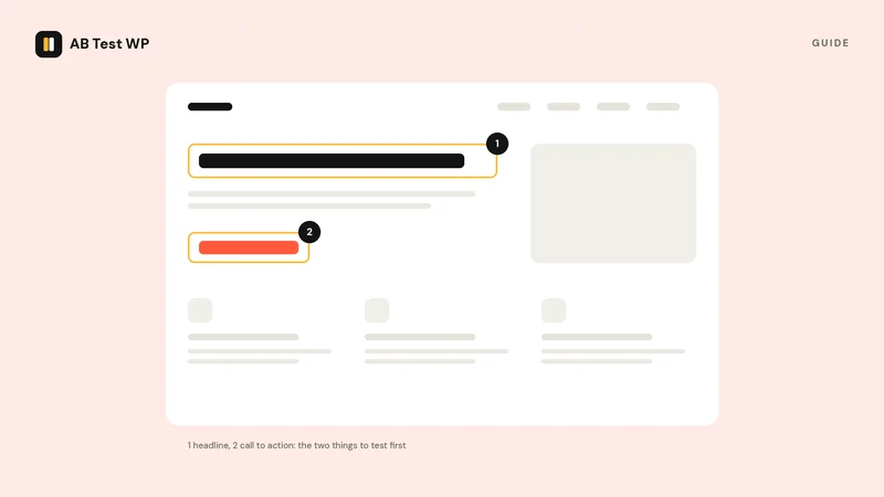
- The headline and the sentence under it. This is what most visitors read, and often the only thing. If it describes what the product is rather than what it does for them, or leads with a clever phrase instead of a clear one, that is your first test. Write the alternative in plain words a customer would use.
- The offer itself. Free trial versus demo, monthly versus annual framing, "starts at" versus a single price, a guarantee shown or not. These are large changes and large changes produce detectable effects on modest traffic.
- What is above the fold. A hero that is a large image and a slogan versus a hero that states the offer and shows the button. Move the form up. Put the primary action where it is seen without scrolling.
- The number of things asking for attention. Pages accumulate calls to action. A version with one primary button and everything else demoted is a strong first challenger, because it changes the page's shape rather than a detail.
- Trust at the point of decision. A guarantee, a real customer quote, a "no card required" line, next to the button rather than in a section further down.
- Form length. Every field you can remove is worth testing. Ask for what you need to deliver the thing, and nothing you merely want.
Notice what is not on the list. Button colour, font choice, the wording of a secondary link, the footer. Those are real tests, but they are for later, when you have the traffic to detect a 3% lift and the data to know which small thing matters.
Write the hypothesis before you build anything
A first test succeeds or fails on whether it teaches you something, and that depends on stating what you expect. A useful format:
Hypothesis template
Because [what you observed or believe about visitors], we expect that [the specific change] will [increase or decrease] [the goal] by at least [the smallest lift you would act on].
Example: "Because the headline describes features and visitors arrive from a search about the problem, we expect that a headline stating the outcome will increase pricing-page clicks by at least 20%."
Two things this forces. The first is a specific change, not a redesign; if the variant differs in six ways, a win teaches you nothing about which one worked. The second is a threshold. That "at least 20%" is the minimum detectable effect your sample-size calculation needs, and it is the line that decides, in advance, whether a small positive result is worth shipping.
Check the arithmetic before you start
Three numbers into the sample-size calculator: the page's current conversion rate, the lift in your hypothesis, and the page's daily visitors. It returns how many visitors you need and how many days that is.
If the answer is under four weeks, proceed. If it is six to eight weeks, it is still worth running but consider a bolder change with a larger expected effect. If it is months, the page does not have the traffic for this test; pick a higher-traffic page, test a higher-frequency action such as the button click instead of the purchase, or make the change without testing. Not every improvement needs an experiment.
Build the variant, and only the variant
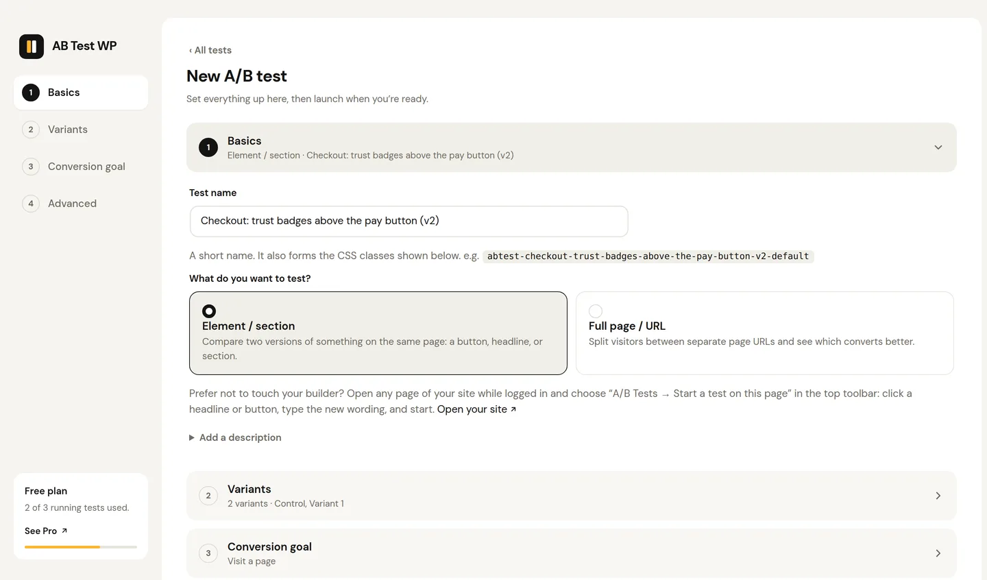
Keep the original exactly as it is. Change one thing in the challenger, as cleanly as you can. In practice on WordPress this means duplicating the section or element in your builder and editing the copy, then tagging it so the testing tool can tell the two apart. With a tool that matches variants by a CSS class, that tag is one field in any builder; the WordPress testing guide walks through it, and the Elementor tutorial shows the exact clicks for one builder.
Before you start the test, load the page in a private window several times and confirm both versions render correctly, at desktop and mobile widths. A variant that is broken on phones will lose, and you will have learned the wrong lesson.
Run it to the number, then read it once
Set the test running and do not touch it. Do not read the live results daily; the numbers will swing for the first several hundred visitors and every swing will tempt you. Run to the sample size you calculated, over whole weeks, and then read the result.
Three outcomes, all useful:
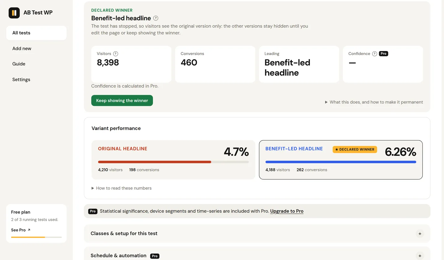
- The challenger won by at least your threshold. Ship it, and write down why you think it worked. That reason is your next hypothesis.
- No significant difference. The change did not matter to visitors, which means the thing you changed was not what was holding them back. Keep the original (it is simpler) and move down the list.
- The challenger lost. The most informative result of the three. Something in the original was doing work you did not credit. Look at what you removed or changed.
Whichever it is, record it: page, hypothesis, result, date. After five or six tests that log is worth more than any single win, because it tells you what your visitors respond to.
Three good first tests, concretely
For a SaaS or plugin site
Homepage headline. Original: the product name and a tagline. Challenger: one sentence stating the outcome for the customer, one sentence saying how. Goal: clicks to the pricing or signup page.
For a WooCommerce store
Product page trust. Original: the buy button alone. Challenger: the button plus, directly beneath it, shipping cost, return window and one line of guarantee. Goal: add to cart. The purchase itself is the goal you care about, but add-to-cart converts far more often and finishes the test in a fraction of the time.
For a lead-generation or services site
The contact form. Original: name, email, phone, company, budget, message. Challenger: name, email, message. Goal: form submissions. Then check the lead quality by hand for a month, because fewer fields sometimes means more but worse leads, and that is the real answer to the question.
What not to do on a first test
- Do not test the price. Showing different visitors different prices for the same thing is a customer-trust problem before it is a statistics problem, and some jurisdictions treat it as a legal one. Test how the price is presented, not what it is.
- Do not run several tests on one page at once. Their effects mix and you cannot attribute the result.
- Do not change the variant mid-test. The moment you edit it, the data before the edit describes a different page. Stop, edit, restart.
- Do not stop early because it "looks done". The how long to run a test article explains why the early confidence number is the least trustworthy number the tool will ever show you.
Everything above applies to any testing tool. If you want one that runs on your own WordPress server with no traffic limits, that is what we are building, and the how it works page shows the mechanism.
Common questions
What should I A/B test first?
The headline and the sentence under it on your highest-traffic page, measured against that page's single most important action. Headlines, the offer, what sits above the fold, the number of calls to action, trust near the button and form length move results far more often than colours or fonts.
Should my first test be a button colour?
Usually not. Button colour tests need very large samples to detect their typically small effects, and a 'no difference' result on a first test teaches you little. Save small changes for when you have the traffic to detect them.
How do I write an A/B test hypothesis?
State what you believe about visitors, the specific single change, the goal it should move, and the smallest lift you would act on. That threshold doubles as the minimum detectable effect for your sample-size calculation.
Can I test prices?
Showing different visitors different prices for the same product creates a customer-trust problem and can be a legal one in some jurisdictions. Test how a price is presented, not what it is.